Making Miniflux more usable
I think the default experience of Miniflux, and by extension most RSS readers, sucks and we can do better.
The biggest flaw of RSS readers is that they treat it like e-mail or in the case of Miniflux they treat it like Reddit sorted by “new”.
I use RSS to subscribe to things that interest me. I don’t care to read everything written by XYZ on XYZ date. I might read it 3 months after it was written, it really doesn’t bother me. To me RSS should not be something stressful, it shouldn’t make you feel that you have to look at every item. Instead you should treat it as a database of interesting stuff and not a hive of “phantom obligations”.
The default experience of Miniflux is awful. It is based on a website that usually gets around 10 items posted a day. If you just naturally follow stuff that you find interesting it is very easy to be like me and have 80,000 unread things. I use to think that was a bad thing (due to the phantom obligations) but in actuality it means I found a lot of interesting stuff on the internet.
Miniflux was originally my least favorite RSS newsreader. But after learning you can inject arbitrary CSS and JS it is now my favorite. Because of this Miniflux can easily be the best feed reader there is since you can just remove all of the bullshit and a lot of the wonky UI.
My changes to Miniflux
Change default view to be categories. I personally like categories as the way to view because categories let you see sort feeds into convenient groups. Sometimes I feel like I want to read about “politics” but other times I really don’t want to. Sometimes I am lacking a game to really enjoy and so I am much receptive to reading “gaming blogs”. Sometimes I want to laugh and so I want to read “comics”. River of news sucks if you try to follow all of the personally interesting sites on the web. Its actually unnavigable
Then change entry sorting to “Recent entries first”. I don’t get why it doesn’t do this by default
I also think there is too much extraneous information and that there is too much much padding. Most of the time date doesn’t matter to me. It is not like a forum where replying to a 4 month old story is kinda rude and non-sensical (usually impossible on most websites that lock threads after X days). You can read whatever you want on the internet no matter the age of the post.
I also think you shouldn’t look at any number. They are pointless. I don’t care if a entry has 353 unread articles or just two.
We can get rid of all of this garbage with some added CSS.
#page-header-title span {
  display: none;
}

.item-title span {
  display: none;
}

.feed-parsing-error {
    display: none;
}

.item-meta {
    display: none;
}

.item {
  margin-bottom: 0px;
}


.category > a {
  display: none;
}

.category {
  border: none;
  background-color: none;
}

#feed-entries-counter {
  display: none;
}

.unread-counter-wrapper {
  display: none;
}
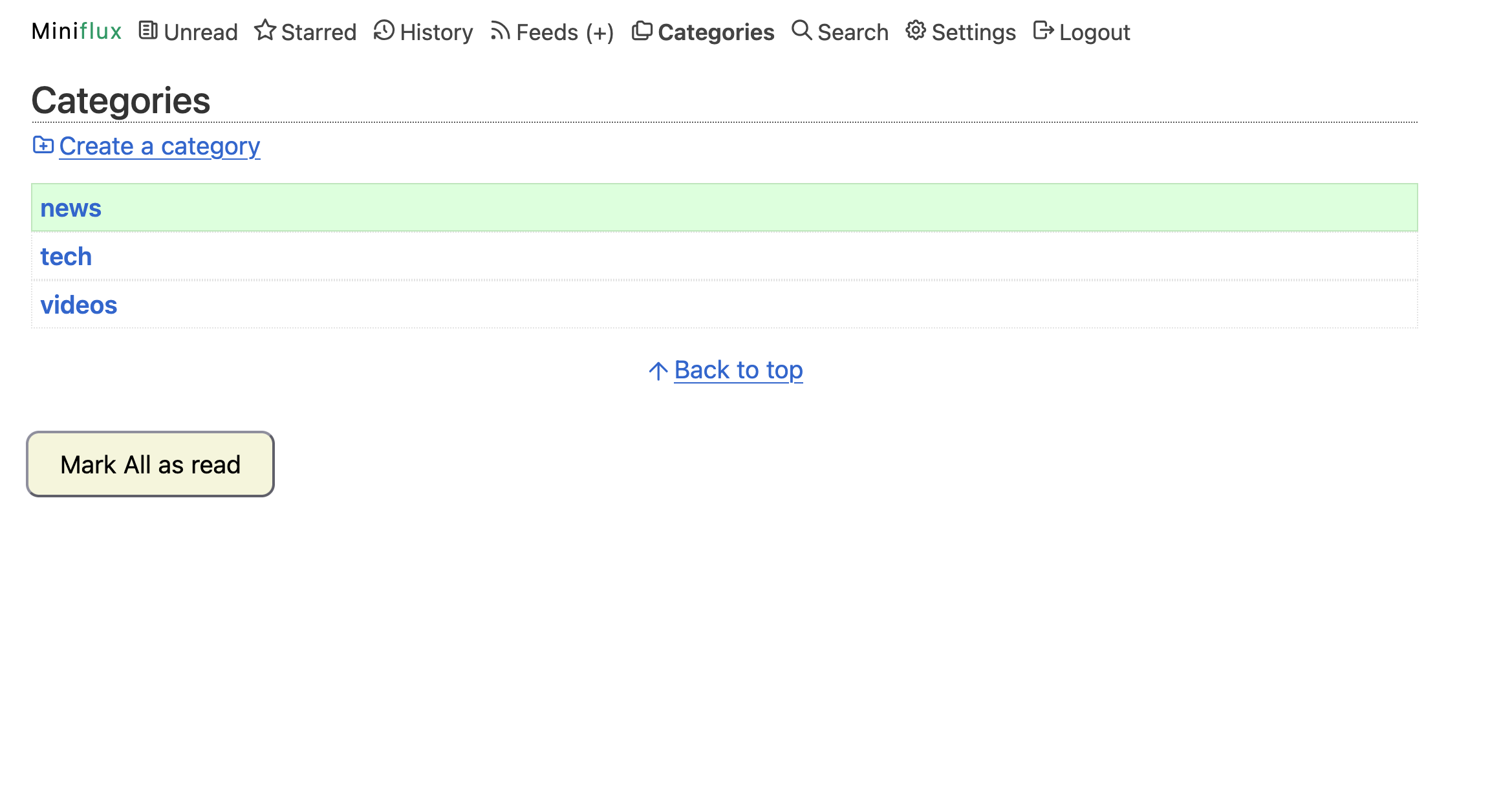
Certain aspects of the UI actually suck. The most egregious is that “mark all as read” requires two taps and is a very small button. Its not so bad on desktop since I usually just hit the keyboard shortcut but it is absolutely painful on mobile. I improved the situation by adding a giant button that I just have to press once.
I like to put everything into categories. Usually by topic since I only care to read about X topic when I am in the mood for it. I have some JavaScript that opens it in “river of news” or “feed list view” depending on the category.
In the settings:
I also think there is too much extraneous information and that there is too much much padding. Most of the time date doesn’t matter to me. It is not like a forum where replying to a 4 month old story is kinda rude and non-sensical (usually impossible on most websites that lock threads after X days).
I also think you shouldn’t look at any number. They are pointless. I don’t care if a entry has 353 unread articles or just two.
Change some defaults in the settings
-
remove “all” category. Whats the point?
-
make default home:
categories -
entry sorting:
recent entries first -
entries per page: a big number like
300
Better design
Get rid of numbers and make it more compact.
#page-header-title span {
  display: none;
}

.item-title span {
  display: none;
}

.feed-parsing-error {
    display: none;
}

.item-meta {
    display: none;
}

.item {
  margin-bottom: 0px;
}


.category > a {
  display: none;
}

.category {
  border: none;
  background-color: none;
}

#feed-entries-counter {
  display: none;
}

.unread-counter-wrapper {
  display: none;
}
Better behavior
Make the default open behavior contextual and more sensible.
if (document.getElementsByTagName("title")[0].innerHTML == 'Categories (3) - Miniflux') {
    let categoryTitles = document.getElementsByClassName("item-title");
    for (let i = 0; i < categoryTitles.length; i++) {
        if (categoryTitles[i].querySelector("a").text.includes("comics")    ||
            categoryTitles[i].querySelector("a").text.includes("videos")    ||
            categoryTitles[i].querySelector("a").text.includes("podcasts"))
        {
            // NEVER GONNA GIVE YOU UP
        }
        else
        {
            categoryTitles[i].querySelector("a").href = categoryTitles[i].querySelector("a").href.replace(/entries$/, "feeds");
        }
    }
}
Add a button that is useful for marking as read for mobile devices. This code is ugly and I need to make it nicer.
// button
function Marky() {
    const markButtons = Array.from(document.querySelectorAll('a, button'))
          .filter(el =>
                  /Mark this page as read/i.test(el.textContent.trim())
                  || el.classList.contains('markPageAsRead')
                  || el.id === 'markPageAsRead'
          );

    markButtons.forEach(btn => {
        btn.click();
    });

    const buttons = document.querySelectorAll('button');

    // Look for one whose text content is "Yes"
    const yesButtons = Array.from(buttons).filter(
        btn => btn.textContent.trim().toLowerCase() === 'yes'
    );

    yesButtons.forEach(btn => {
        btn.click();
    });
}

const buttonz = document.createElement('button');

// Set the button text
buttonz.textContent = 'Mark All as read';

// (Optional) Add a CSS class or styling
buttonz.style.padding = '10px 20px';
buttonz.style.fontSize = '16px';
buttonz.style.borderRadius = '8px';
buttonz.style.cursor = 'pointer';
buttonz.style.background = 'beige';

// (Optional) Add an event listener
buttonz.addEventListener('click', Marky);

// Add the button to the page (for example, inside <body>)
document.body.appendChild(buttonz);
I have not even actually touched trying to make any aesthetic UI changes. But Miniflux should make that easy compared to other readers.
Screenshot